Block Editor: Reverse Columns on Mobile
Adds a "Reverse on Mobile" option to the Columns, Row, Stack and Media & Text blocks in Gutenberg.
Plugin info
Maintenance & Compatibility
Maintenance score
Maintained • Last updated 156 days ago • Support resolved 100% • 4 reviews
Is Block Editor: Reverse Columns on Mobile abandoned?
Likely maintained (last update 156 days ago).
Compatibility
Similar & Alternatives
Explore plugins with similar tags, and compare key metrics like downloads, ratings, updates, support, and WP/PHP compatibility.
Description
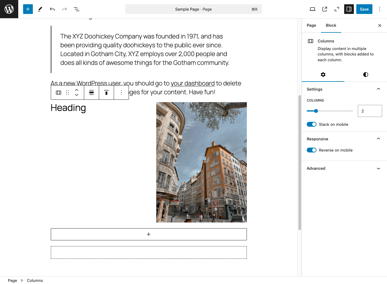
This plugin adds a “Reverse on Mobile” option to the Columns, Row, Stack and Media & Text blocks in the WordPress Gutenberg block editor. This option allows you to reorder columns in mobile view for better presentation.
Installation
- Download the plugin.
- Unzip the downloaded file.
- Upload the
block-editor-columns-reversefolder to the/wp-content/plugins/directory. - Activate the plugin through the ‘Plugins’ menu in WordPress.
Frequently Asked Questions
The core/columns, core/group (flex layouts), and core/media-text blocks are supported.
In the block editor, select a Columns, Row, Stack or Media & Text block, then go to the block settings in the sidebar. You will see an option to “Reverse on Mobile”.
Note: For Row blocks, you must enable “Allow to wrap to multiple lines” in the Layout settings for the reverse option to appear.
The mobile view breakpoint is set at less than 782px, matching the one used for the core/columns block. When the screen width is 781px or smaller, columns will reverse their order if the “Reverse on Mobile” option is enabled.
For the core/media-text block, the default breakpoint is 600px or below.
Review feed
Simple plugin that does what needs to be done
Screenshots
"Reverse on Mobile" option in the block settings.

Example of columns reversed in mobile view.
Changelog
1.0.8
- Fixed: Group Row blocks with wrap disabled (nowrap) no longer display the “Reverse on mobile” option in settings.
- Fixed: Group Row blocks with wrap enabled now use
wrap-reverseto correctly reverse elements when they wrap to multiple lines. - Fixed: Horizontal alignment (left/right/center/space-between) is now preserved when Row blocks wrap.
1.0.7
- Support for 6.8.X.
1.0.6
- Refactor responsive styles.
- Add support for
core/media-textbreakpoint (<= 600px).
1.0.5
- Removed the ‘Reverse on mobile’ option in
core/groupwhen the layout is undefined.
1.0.4
- Fix: Resolved the issue where ‘Reverse on mobile’ always stacked elements on mobile, even when ‘Stack on mobile’ was turned off.
- Separated CSS for front-end and editor.
1.0.3
- Added support for
core/media-textblock. - Removed the option when the group block is in the default constrained layout.
1.0.2
- Improvements to avoid potential conflicts with third-party code.
1.0.1
- Support for 6.7.X.
- Update text domain for i18n consistency.
1.0.0
- Initial release of the plugin.