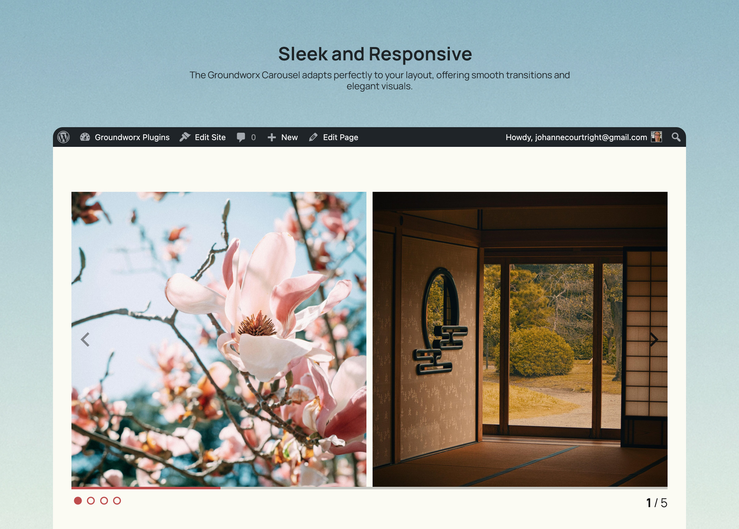
Groundworx Carousel
A powerful and responsive carousel block built with Splide.js and fully integrated into the WordPress block editor. Create stunning carousels with any …
Plugin info
Maintenance & Compatibility
Maintenance score
Maintained • Last updated 137 days ago • 1 reviews
Is Groundworx Carousel abandoned?
Likely maintained (last update 137 days ago).
Compatibility
Similar & Alternatives
Explore plugins with similar tags, and compare key metrics like downloads, ratings, updates, support, and WP/PHP compatibility.
Description
Groundworx Carousel is a flexible Gutenberg block that transforms any WordPress content into beautiful, responsive carousels. Built on the lightweight Splide.js library, it offers advanced responsive controls, multiple design templates, and extensive customization options—all within WordPress’s native block editor.
Perfect For
- Image galleries and photo carousels
- Testimonial and review sliders
- Product showcases and e-commerce displays
- Hero sections and featured content
- Client logo carousels
- Team member presentations
- Portfolio galleries
- Content marketing sliders
- Blog post carousels
- Before/after comparisons
Key Features
🎨 Nine Professional Templates
Choose from carefully designed templates to match your content style:
* Default & Default Alt – Classic carousel layouts with external navigation
* Simple, Simple Left, Simple Right – Clean minimalist designs with flexible content positioning
* Overlay & Overlay Alt – Modern content overlaid on images with gradient backgrounds
* Partial Overlay & Partial Overlay Alt – Balanced layouts with partial content overlays
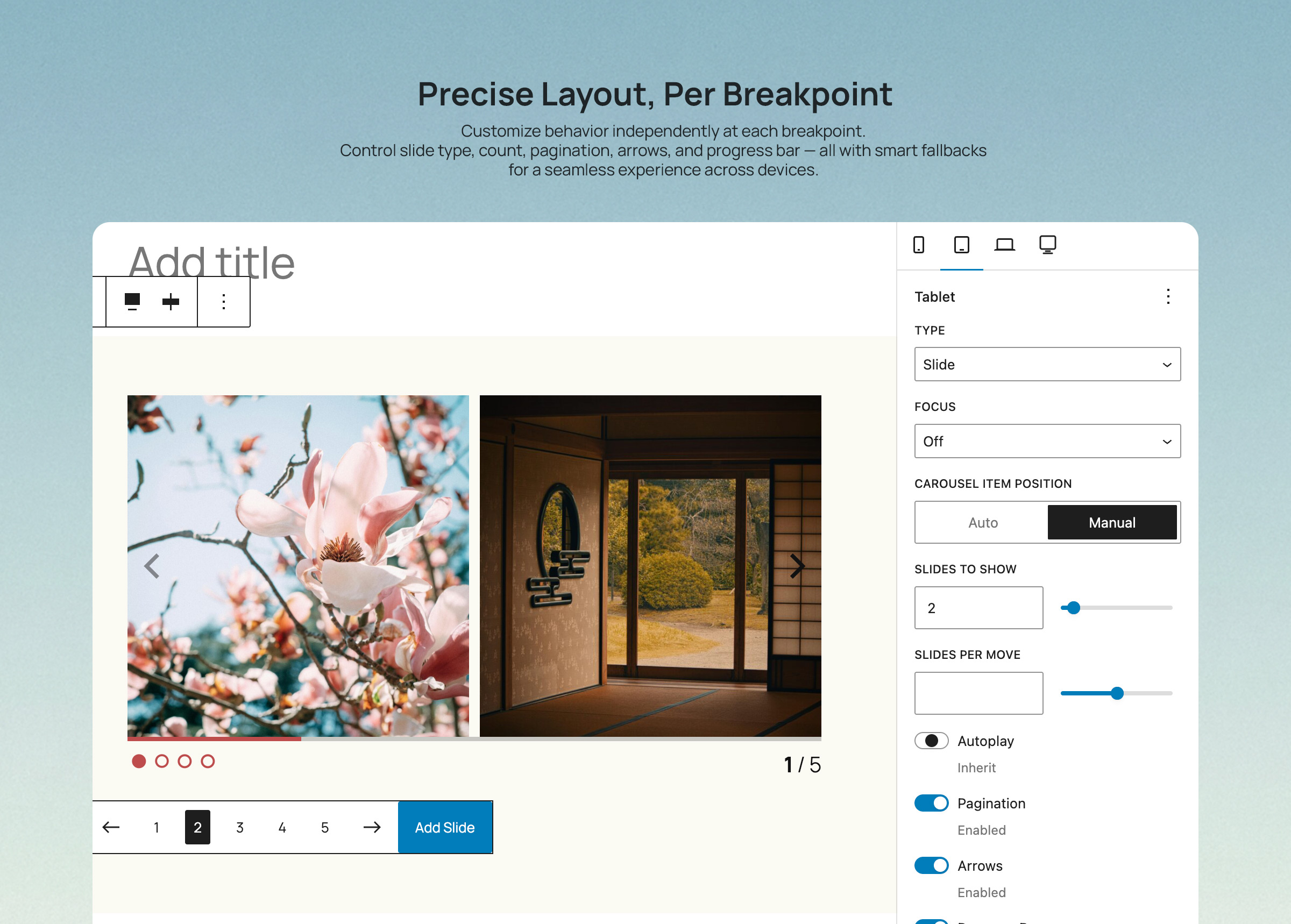
📱 Advanced Responsive Controls
* Configure carousel behavior per breakpoint (mobile, phone, large-phone, tablet, large-tablet, laptop, desktop, large-desktop)
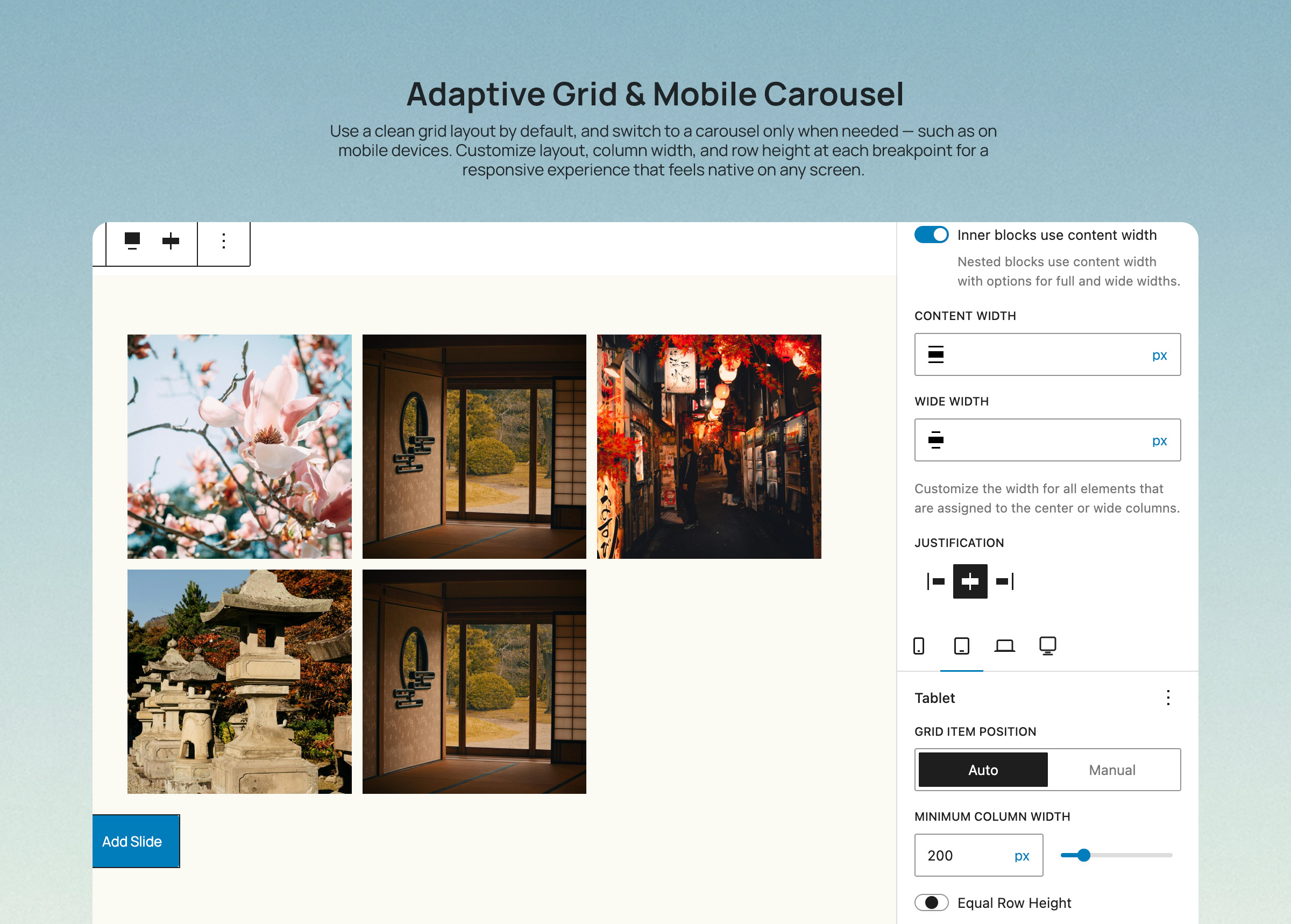
* Responsive grid fallback – destroy carousel at specific breakpoints to display slides as a grid
* Mobile-first breakpoint system with inheritance
* Full touch and swipe gesture support for mobile devices
* 8 total breakpoint levels for precise responsive control
🎯 Carousel Types & Transitions
* Slide mode – Classic horizontal sliding carousel
* Loop mode – Infinite continuous scrolling with clones
* Fade transitions – Smooth crossfade effects between slides
* Customizable animation speed and easing
* Rewind option for non-loop carousels
⚙️ Flexible Display Options
* Multiple slides per page with responsive settings
* Variable slide width (auto) or fixed width options
* Center mode with focus control
* Customizable gap spacing between slides
* Autoplay with interval and pause-on-hover
* Auto-height adjustment option
🎚️ Navigation & UI Controls
* 11 Arrow Styles: arrow, chevron, chevronRounded, halfArrow, play, playRounded, sharpChevron, thinChevron, thinChevronRounded, triangle, triangleRounded
* 9 Pagination Styles: circle, circleOutline, square, squareOutline, diamond, diamondOutline, rectangle, rectangleOutline, number
* Progress bar indicator
* Slide counter display (e.g., “3 / 10”)
* Hide/show controls per breakpoint
* Color customization for all UI elements
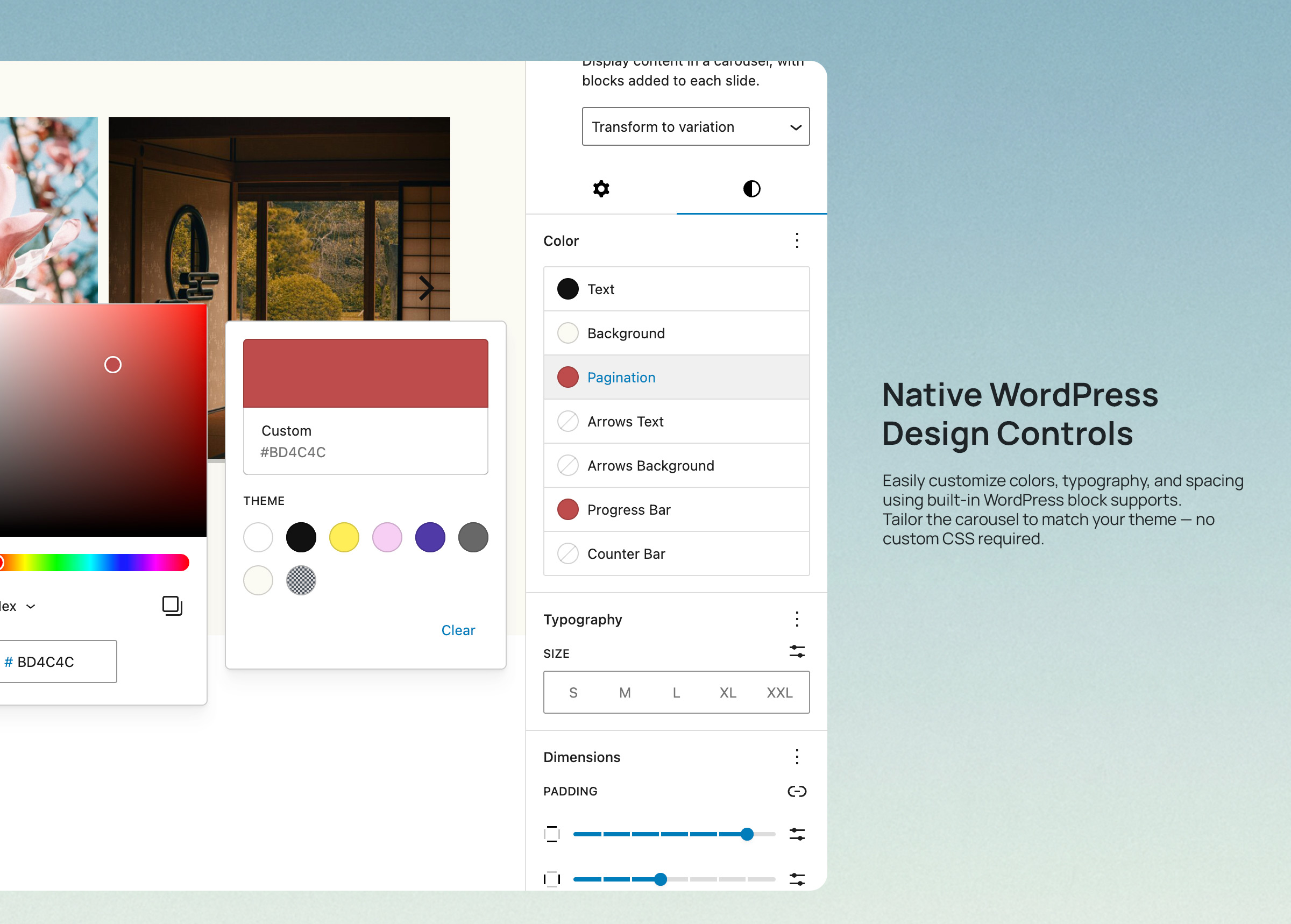
🎨 Advanced Color Controls
Customize every UI element with independent color pickers:
* Arrows: text, background, border colors
* Active Pagination: text, background, border colors
* Inactive Pagination: text, background, border colors
* Progress Bar: foreground and background colors
* Counter: text color
♿ Accessibility First
* ARIA labels and semantic HTML structure
* Keyboard navigation support (arrow keys, Enter, Space)
* Screen reader friendly with live regions
* WCAG compliant markup
* Focus management and visible focus states
🔧 Developer Features
* Block variations support via wp.blocks.registerBlockVariation()
* Custom Splide.js options via attributes
* Extensible template system with WordPress hooks
* Breakpoint configuration via JSON file
* React hooks for responsive state management
* CSS custom properties for styling integration
* Well-documented, modular code structure
Works With Any Block
The Carousel block is a container that accepts any WordPress block as slides:
* Core Image block
* Core Paragraph block
* Core Heading block
* Core Group block
* Core Cover block
* Core Buttons block
* Custom blocks from other plugins
* Your own custom blocks
Each slide is fully customizable using WordPress’s native block editing tools.
Built on Splide.js
Powered by Splide.js 4.x – a lightweight (28KB gzipped), accessible, and performant carousel library. No jQuery required. Optimized for modern browsers with progressive enhancement.
Part of Groundworx Core
This carousel block is part of the Groundworx Block Suite—a modular collection of high-performance, design-focused blocks built for modern WordPress development. Uses Groundworx Foundation components for consistent, professional UI controls.
Developer Notes
Registering Custom Block Variations
You can register custom carousel variations using wp.blocks.registerBlockVariation() and pass Splide configuration options via the splideOptions attribute.
Example: Carousel with Grid Fallback at Tablet
wp.blocks.registerBlockVariation('groundworx/carousel', {
  name: 'carousel-to-tablet',
  title: 'Carousel / Grid Tablet',
  attributes: {
    template: 'default',
    splideOptions: {
      type: 'loop',
      perPage: 1,
      arrows: true,
      pagination: true
    },
    breakpoints: {
      tablet: {
        layout: {
          type: 'grid',
          columnCount: 3
        }
      }
    }
  },
  scope: ['block', 'inserter', 'transform']
});
Example: Auto-Width Carousel
wp.blocks.registerBlockVariation('groundworx/carousel', {
  name: 'auto-width-carousel',
  title: 'Auto Width Carousel',
  attributes: {
    splideOptions: {
      type: 'loop',
      fixedWidth: '300px',
      focus: 'center',
      gap: '1rem'
    }
  }
});
Adding Custom Templates
Use the groundworx.carousel.templates filter to add custom templates:
wp.hooks.addFilter(
  'groundworx.carousel.templates',
  'my-theme/add-custom-template',
  (templates) => [
    ...templates,
    {
      label: 'My Custom Template',
      value: 'my-custom'
    }
  ]
);
Then add your template styles in your theme:
.template-my-custom .splide__slide {
  /* Your custom styles */
}
Supported Breakpoints
The carousel supports 7 configurable responsive breakpoints plus a mobile/default base, following a mobile-first approach:
- Mobile/Default: 0-374px (base configuration)
- phone: 375px and up
- large-phone: 480px and up
- tablet: 680px and up
- large-tablet: 960px and up
- laptop: 1080px and up
- desktop: 1280px and up
- large-desktop: 1440px and up
Settings cascade from mobile to larger screens. Override at any breakpoint to change behavior.
Grid Fallback Breakpoints:
For grid fallback functionality, you can use any of the 7 breakpoints: phone, large-phone, tablet, large-tablet, laptop, desktop, or large-desktop.
Splide.js Options
All Splide.js options are supported via the splideOptions attribute. Common options:
type: ‘slide’, ‘loop’, or ‘fade’perPage: Number of slides per pagefixedWidth: Fixed width for each slide (e.g., ‘300px’)gap: Space between slidesautoplay: Enable/disable autoplayinterval: Autoplay interval in millisecondsspeed: Transition speed in millisecondsrewind: Enable rewind for non-loop carouselsarrows: Show/hide arrowspagination: Show/hide paginationfocus: ‘center’ for center modeautoHeight: Adjust height to current slide
Full documentation: https://splidejs.com/guides/options/
CSS Custom Properties
/* Arrow Colors */
--gwx--color--arrows
--gwx--background-color--arrows
--gwx--border-color--arrows

/* Active Pagination Colors */
--gwx--color--pagination
--gwx--background-color--pagination
--gwx--border-color--pagination

/* Inactive Pagination Colors */
--gwx--color--inactive-pagination
--gwx--background-color--inactive-pagination
--gwx--border-color--inactive-pagination

/* Progress Bar Colors */
--gwx--color--progress
--gwx--background-color--progress

/* Counter Color */
--gwx--color--counter
Template Classes
Each template adds a class to the carousel wrapper:
.template-default.template-default-alt.template-simple.template-simple-left.template-simple-right.template-overlay.template-overlay-alt.template-partial-overlay.template-partial-overlay-alt
Use these for template-specific styling.
Privacy
This plugin does not collect, store, or transmit any user data. It operates entirely within your WordPress installation and does not make external API calls except for loading assets from your own server.
Credits
- Built with Splide.js by Naotoshi Fujita – A lightweight, accessible slider library
- Developed by Groundworx Agency LLC
- Created and maintained by Johanne Courtright
- Part of the Groundworx Core framework
- Website: https://groundworx.dev
- Support: https://ko-fi.com/groundworx
Additional Resources
Installation
Automatic Installation
- Log in to your WordPress admin dashboard
- Navigate to Plugins > Add New
- Search for “Groundworx Carousel”
- Click Install Now and then Activate
Manual Installation
- Download the plugin ZIP file
- Log in to your WordPress admin dashboard
- Navigate to Plugins > Add New > Upload Plugin
- Choose the downloaded ZIP file and click Install Now
- Activate the plugin through the Plugins menu
Getting Started
- Create or edit a post or page
- Click the “+” icon to add a new block
- Search for “Carousel” or find it under the “Design” category
- Add the Carousel block to your content
- Click “Add Slide” to insert slides
- Add any blocks inside each slide (images, text, buttons, etc.)
- Customize carousel settings in the sidebar panel
- Configure responsive behavior for each breakpoint
- Choose arrow and pagination styles
- Customize colors for UI elements
- Preview and publish
Frequently Asked Questions
Yes! The Carousel block supports all Gutenberg inner blocks. Add images, text, buttons, groups, covers, or any custom blocks as slides. Each Slide block is a flex container that accepts any inner content.
Absolutely. The carousel includes full touch and swipe support for mobile and tablet devices powered by Splide.js. You can also configure different behaviors per breakpoint or disable the carousel entirely on larger screens.
Yes! Use the responsive grid fallback feature. In the block settings, configure each breakpoint (tablet, laptop, desktop) to display as a grid instead of a carousel. This is perfect for responsive design strategies where you want a carousel on mobile but a grid layout on desktop.
Use the block settings panel (sidebar) to configure:
* Carousel type (slide, loop, fade)
* Number of slides to show per page at each breakpoint
* Slide width (manual count or auto width)
* Autoplay settings with interval control
* Navigation arrows and pagination visibility
* Arrow style (11 options)
* Pagination style (9 options)
* Progress bar and counter toggles
* Colors for all UI elements
* Responsive behaviors per breakpoint
Version 2.0 includes 9 professionally designed templates:
* Default – Classic layout with standard navigation
* Default Alt – Alternative classic layout
* Simple – Minimalist design, center-aligned content
* Simple Left – Minimalist with left-aligned content
* Simple Right – Minimalist with right-aligned content
* Overlay – Content overlaid on images with gradient
* Overlay Alt – Alternative overlay design
* Partial Overlay – Split layout with partial overlay
* Partial Overlay Alt – Alternative partial overlay
Developers can add custom templates using the groundworx.carousel.templates filter hook.
Choose from professionally designed options:
Arrow Styles (11 options):
arrow, chevron, chevronRounded, halfArrow, play, playRounded, sharpChevron, thinChevron, thinChevronRounded, triangle, triangleRounded
Pagination Styles (9 options):
circle, circleOutline, square, squareOutline, diamond, diamondOutline, rectangle, rectangleOutline, number
Each style can be customized with your theme colors.
The carousel uses 7 responsive breakpoints plus a mobile/default base with a mobile-first approach:
* Mobile/Default: 0-374px (base styles)
* Phone: 375px and up
* Large Phone: 480px and up
* Tablet: 680px and up
* Large Tablet: 960px and up
* Laptop: 1080px and up
* Desktop: 1280px and up
* Large Desktop: 1440px and up
Settings cascade from mobile to larger screens. Configure each breakpoint independently or let settings inherit from smaller breakpoints.
Yes! Developers can register custom block variations using wp.blocks.registerBlockVariation() and pass Splide configuration options via the splideOptions attribute. See the Developer Notes section for examples.
Yes. The carousel follows accessibility best practices:
* Proper ARIA labels and roles (aria-label, aria-live, role="presentation")
* Keyboard navigation support (arrow keys, Enter, Space, Tab)
* Focus management with visible focus indicators
* Screen reader compatibility with live regions
* Semantic HTML structure
* WCAG 2.1 AA compliant
The plugin is optimized for performance:
* Minimal JavaScript footprint (Splide.js is only 28KB gzipped)
* Efficient CSS architecture with scoped styles
* Conditional asset loading (only loads on pages with carousels)
* Support for lazy loading images
* No jQuery dependency
* Modern ES6+ code compiled for browser compatibility
Yes! The Groundworx Carousel Block works with any theme or page builder that supports WordPress’s native block editor (Gutenberg), including:
* Full Site Editing (FSE) themes
* Classic WordPress themes
* Block themes
* Kadence, GeneratePress, Astra, Blocksy, and other popular themes
* Any page builder with Gutenberg support
In the block settings:
1. Go to the Tablet, Laptop, or Desktop breakpoint tab
2. Set the layout type to Grid
3. Configure grid columns (manual count or auto width)
4. Optionally enable Same Height for uniform grid items
The carousel will display normally on mobile but switch to a grid layout at your chosen breakpoint.
Yes! The carousel uses CSS custom properties (variables) for easy customization:
* --gwx--color--arrows
* --gwx--background-color--arrows
* --gwx--border-color--arrows
* --gwx--color--pagination
* --gwx--background-color--pagination
* --gwx--border-color--pagination
* --gwx--color--inactive-pagination
* --gwx--background-color--inactive-pagination
* --gwx--border-color--inactive-pagination
* --gwx--color--progress
* --gwx--background-color--progress
* --gwx--color--counter
You can also target template-specific classes like .template-overlay or .template-simple-left.
Version 2.0 maintains backward compatibility with v1.x carousels. After updating:
1. Your existing carousels will continue to work without changes
2. Review carousel settings to take advantage of new features
3. Explore the new template system
4. Configure responsive settings as desired
5. Test on all devices to ensure optimal display
We recommend creating a backup before major updates.
For support, feature requests, or bug reports:
* Visit: https://groundworx.dev
* GitHub: https://github.com/groundworx-dev/groundworx-carousel
* WordPress.org Support Forums: https://wordpress.org/support/plugin/groundworx-carousel/
Review feed
Screenshots
Carousel block in the WordPress block editor with responsive controls
Nine professional templates to choose from
Advanced color customization for all UI elements
Responsive grid layout panel with breakpoint configuration
Changelog
2.0.0
Release Date: November 12, 2024
Major Update – Complete Redesign
New Features:
* Added 9 professional design templates (Default, Default Alt, Simple variants, Overlay variants, Partial Overlay variants)
* Introduced comprehensive responsive control system with 7 breakpoint levels
* Added responsive grid fallback option (destroy carousel at specific breakpoints)
* New advanced color controls for all UI elements with multi-color picker
* Added 11 arrow style options (arrow, chevron variants, play variants, triangle variants)
* Added 9 pagination style options (circle, square, diamond, rectangle, with filled/outline variants, plus numbers)
* Implemented progress bar indicator
* Implemented slide counter display
* Added per-breakpoint visibility controls for all UI elements
* Template system with WordPress hooks for developers
Enhanced Responsive System:
* 8 breakpoint levels (mobile/default + 7 configurable breakpoints: phone, large-phone, tablet, large-tablet, laptop, desktop, large-desktop)
* Per-breakpoint configuration for all carousel options
* Inheritance system – settings cascade from mobile to larger screens
* Grid layout options per breakpoint (manual column count or auto width)
* Same height toggle for grid layouts
UI/UX Improvements:
* Complete redesign of block inspector controls
* Improved color customization with dedicated color panels
* Better visual feedback for arrow and pagination style selection
* Enhanced responsive controls with clear inheritance indicators
* Streamlined settings organization
Developer Features:
* Extensible template system via WordPress hooks
* Custom Splide.js options support
* React hooks for responsive state management (useResponsiveState, useSplideOptions)
* Modular component architecture
* CSS custom properties for styling
* Block variation support
Performance:
* Optimized code structure with modular components
* Improved asset loading
* Better carousel initialization and destruction handling
* Reduced unnecessary re-renders
Accessibility:
* Enhanced ARIA labels and roles
* Improved keyboard navigation
* Better screen reader support
* Focus management improvements
Breaking Changes:
* Minimum WordPress version increased to 6.5
* Minimum PHP version increased to 8.2
* Removed deprecated features from v1.x
* Updated to Splide.js 4.x
1.0.4
- Fixed: Removed extra scripts library to reduce redundant dependencies
- Tested up to WordPress 6.9.0
- Improved compatibility with latest WordPress version
1.0.3
- Fixed: Adjusted editor canvas width detection for iframe-less block editor in WordPress 6.8+
- Improved editor experience in WordPress 6.8
1.0.2
- Fixed: Breakpoint configuration loading from plugin path
- Resolved issues with responsive breakpoint detection
1.0.1
- Fixed file exclusions for packaging
- Updated metadata for WordPress.org compliance
- Improved plugin repository structure
1.0.0
- Initial release
- Basic carousel functionality with Splide.js
- Arrow and pagination controls
- Support for inner blocks
- Mobile touch/swipe support
- Responsive breakpoint configuration