Lightweight Grid Columns
Easily add desktop, tablet and mobile friendly columns to your content using an easy to use shortcode.
Plugin info
Maintenance & Compatibility
Maintenance score
Possibly abandoned • Last updated 2576 days ago • 42 reviews
Is Lightweight Grid Columns abandoned?
Possibly abandoned (last update 2576 days ago).
Compatibility
Developers
Similar & Alternatives
Explore plugins with similar tags, and compare key metrics like downloads, ratings, updates, support, and WP/PHP compatibility.
Description
Lightweight Grid Columns are super easy to use! Install and activate the plugin, then look for the columns icon within your TinyMCE toolbar (see screenshots).
Specify your desired desktop, tablet and mobile widths of the columns, add your content and then insert your shortcode into your content.
Lightweight Grid Columns uses the awesome Unsemantic Framework: (http://unsemantic.com/)
Check out GeneratePress, our awesome WordPress theme! (https://wordpress.org/themes/generatepress)
Features include:
- Desktop grid width
- Tablet grid width
- Mobile grid width
- Add custom classes
- Add custom inline styles
- Equal height columns
Installation
There’s two ways to install Lightweight Grid Columns.
- Go to “Plugins > Add New” in your Dashboard and search for: Lightweight Grid Columns
- Download the .zip from WordPress.org, and upload the folder to the
/wp-content/plugins/directory via FTP.
In most cases, #1 will work fine and is way easier.
Frequently Asked Questions
How do I add the shortcodes?
- Make sure Lightweight Grid Columns is activated.
- While editing your post or page, go into the “Visual Editor”.
- Look for the columns icon (see screenshots tab).
- Choose your desktop, tablet and mobile grid widths.
- If you’re adding the last column in a row, check the “Last” checkbox (this is important).
What if I don’t want to use the TinyMCE button?
Fair enough! Simply add the shortcode to your content.
For example, the below will output 4 columns on desktop, 2 columns on tablet and 1 column on mobile
[lgc_column grid="25" tablet_grid="50" mobile_grid="100"]Some content[/lgc_column]

[lgc_column grid="25" tablet_grid="50" mobile_grid="100"]Some content[/lgc_column]

[lgc_column grid="25" tablet_grid="50" mobile_grid="100"]Some content[/lgc_column]

[lgc_column grid="25" tablet_grid="50" mobile_grid="100" last="true"]Some content[/lgc_column]
Take note of our last column – see the last=”true” part? Don’t forget 😉
What are my options for percentages?
This is taken directly from (http://unsemantic.com):
There are grid classes named grid-x where “x” is a number that represents the percentage width of each grid unit. These cover multiples of 5, up to 100 (grid-5, grid-10 … grid-95, grid-100). There are also classes for dividing a page into thirds: grid-33 and grid-66 which are 33.3333% and 66.6667% wide, respectively.
Are there any other options I can use in the shortcode?
Yes!
You can use:
class
[lgc_column grid=”25″ tablet_grid=”50″ mobile_grid=”100″ class=”push-25″]Some content[/lgc_column]
style
[lgc_column grid=”25″ tablet_grid=”50″ mobile_grid=”100″ style=”padding-left:0px;”]Some content[/lgc_column]
equal_heights
By default, JS equal heights are set to “true”.
[lgc_column grid="25" tablet_grid="50" mobile_grid="100" equal_heights="true"]Some content[/lgc_column]
Review feed
Great plugin would be even better with Toolset support
Screenshots
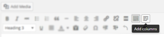
The columns icon in your TinyMCE editor.
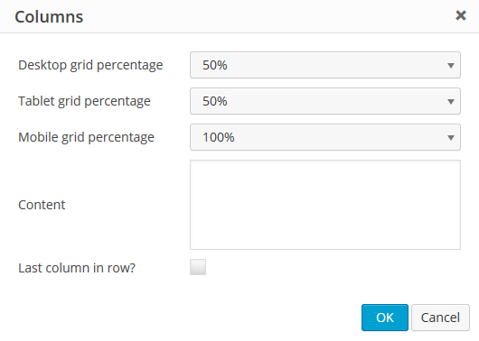
The options inside the columns shortcode generator.
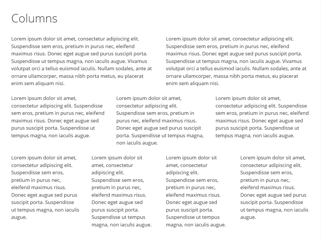
A look at some awesome columns!
Changelog
1.0
- Move custom class value to the parent container
- Code cleanup
0.7
- Fix weird scroll behavior caused by transitions and matchHeight
- Only load matchHeight on pages where columns are present with it enabled
0.6
- Fix column class bug causing some columns not to work
0.5
- Move margin-bottom setting to inner element so style attribute can overwrite it
- Adjust lgc_columns_helper function to fix issue with
<p>and<br />tags around the shortcode - Add jQuery matchHeight to match the height of columns for better responsive user experience
- Reduce the file size of stylesheet considerably
0.4
- Show TinyMCE icon on all post types
0.3
- Fix bug where TinyMCE icon wasn’t showing up if SiteOrigin Page Builder and Black Studio TinyMCE Widget were activated together
- Add IE 7 & 8 compatibility
0.2
- Allow line breaks inside columns
0.1
- Initial release