Maintenance 24/100912d since update
Active installs
3,000
Downloads
37,619
Reviews
24
Age
6.6y
Plugin info
Total downloads: 37,619
Active installs: 3,000
Total reviews: 24
Average rating: 4.9
Support threads opened: 0
Support threads resolved: 0 (0%)
Available in: 1 language(s)
Contributors: 1
Last updated: 10/3/2023 (912 days ago)
Added to WordPress: 9/2/2019 (6 years old)
Minimum WordPress version: 5.0
Tested up to WordPress version: 6.3.7
Minimum PHP version: 5.6
Maintenance & Compatibility
Maintenance score
Possibly abandoned • Last updated 912 days ago • 24 reviews
24/100
Is Modal Guten Block abandoned?
Possibly abandoned (last update 912 days ago).
Compatibility
Requires WordPress: 5.0
Tested up to: 6.3.7
Requires PHP: 5.6
Similar & Alternatives
Explore plugins with similar tags, and compare key metrics like downloads, ratings, updates, support, and WP/PHP compatibility.
Modal Builder Block
Rating 5.0/5 (1 reviews) • Active installs 700
I Agree! Popups
Rating 4.4/5 (5 reviews) • Active installs 600
Cool Ryan Easy Popups
Rating 0.0/5 (0 reviews) • Active installs 10
Modal Dialog
Rating 4.4/5 (16 reviews) • Active installs 600
WooCommerce Order Notes Window
Rating 5.0/5 (2 reviews) • Active installs 30
Shift8 Modal
Rating 0.0/5 (0 reviews) • Active installs 10
Description
This project provides a modal / popup block for the WordPress Gutenberg editor.
- Multiple methods for triggering modal including button, text link, image link, external class, and page load.
- User definable modal content using Gutenberg blocks, for example, image, paragraph etc.
- Support for multiple modal window sizes.
- Modal window transitions for fade, left, right, up down.
- Manual trigger modal initialization by calling bodModal.initModal()
- Custom events for before open, after open, before close, after close so custom code can be used.
- Lots of customizable options including Trigger Button Label, Button Color, Trigger Text, Trigger Text Size, Trigger Image, Trigger Class, Modal Delay, Trigger Element Alignment, Overlay Background Color, Title Text Size, Title Font Color, Title Background Color, Title Padding, Border Radius.
- Supports multiple modals on the same page.
- ADA compliant.
- Modal to modal links.
- Multiple ways to close the modal.
- Escape key
- Close button ‘X’ in the top right of the screen.
- Close button ‘X’ in the modal title.
- Close button at the bottom on the modal content.
- Uses create-guton-block for easy config.
Donations
If you like the plugin, consider a donation to support further development. Click here
Installation
From your WordPress dashboard
- Visit Plugins > Add New
- Search for “Modal Block”
- Install the “Modal Block” plugin
- Activate “Modal Block” from your Plugins page
- Insert Block on your Gutenberg Editor and select “Modal Block” which is located in Widgets.
Frequently Asked Questions
No FAQ available
Review feed
Johan van der Wijk
Love that this is a separate plugin and not part of a collection of blocks
It does what it is supposed to do, easily configurable and I love that this is a separate plugin and not part of a collection of blocks. It keeps WordPress nice and lean.
It would be perfect if the color picker would use the regular Gutenberg color palette chooser :)
kelter
Bump to WP 6.8 for Wordfence
I like this plugin. I've had zero problems. It does it's job and so far has just stayed out of the way. Thank you. I wish Wordfence wasn't so harsh to plugins like this... I got this alert:
Medium Severity Problems:* The Plugin "Modal Guten Block" appears to be abandoned (updated October 3, 2023, tested to WP 6.3.7).
Maybe this could have a version bump just so it's "compatible" with WP 6.7 or 6.8? Then Wordfence would yell less often.
Screenshots
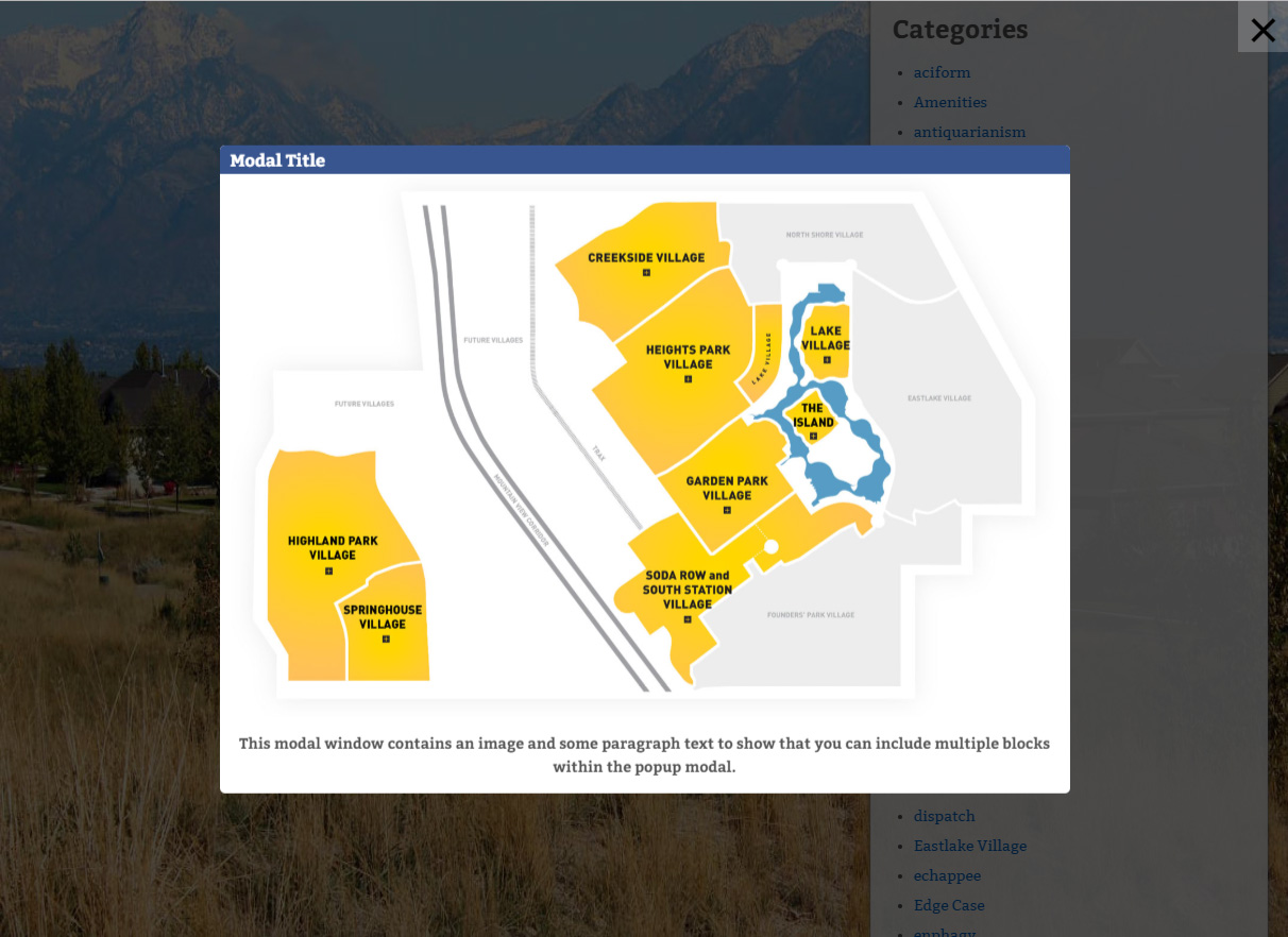
Sample modal window.
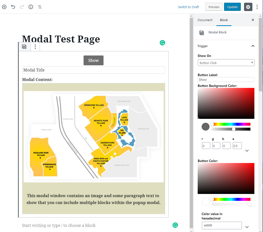
Modal Guten Block in editor.
Changelog
2.1
- Transition effects (fade, left, right, up, down) and ‘Custom Events’ for before modal open, after open, before close, after close
- Manual trigger modal initialization by calling bodModal.initModal()
2.0
- Modal background images. Separate options into Trigger, Modal, Title and Content panels. Title close X ability to define size. Trigger based on URL text.
1.5
- modal to modal links, text align title, title close button
1.4.3
- Option to disable close modal on Escape key press.
1.4.2
- Fixed issue where clicking on nested content in edit mode resulted in modal edit content box closing.
- When modal opened focus on first element but do not scroll to it. Stops modal opening at bottom.
1.4.1
- Fix for when we trigger on image and image is smaller than medium size. In this case we default in the full size image.
1.4
- Make ADA compliant including using button instead of span, setting / returning focus and focus trapping.
- Add custom class to dialog when modal opens.
- Add toggle option to disable close on overlay click.
1.3
- Optional display only once for timer based modals. Modal Id links timer modals on different pages to say they are the same. Also ability to say how long before modal is shown again.
1.2
- Change icon to use SVG – use alt tag from trigger image – optional close btn in modal
1.1
- Update for deprecated wp.editor (changed to wp.blockEditor) and core/editor (changed to core/block-editor).
1.0.0 (8/19/2019)
- First release